At Quadient, we place great emphasis not only on the availability of our software but also on continuously improving the working environment for all employees. This has led to the creation of various voluntary working groups dealing with these issues, not only within the Czech Republic but also internationally. One of them, called the DiverseAbility Group, has come up with the idea of working on accessibility topics and publishing toolkits on them. These toolkits will present various constraints and advice on how to approach them. The first toolkit deals with color blindness and related issues.
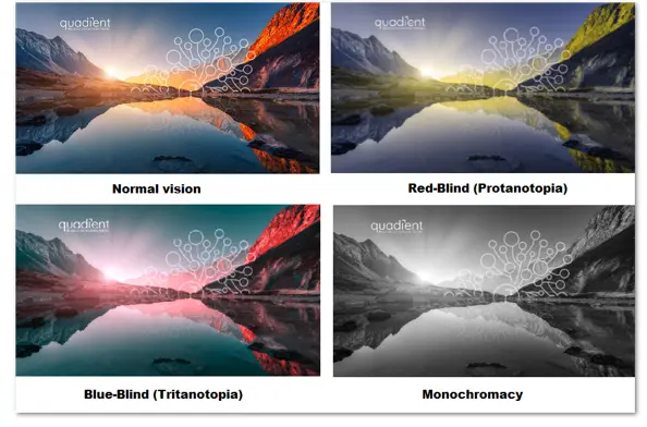
To start with, there are different types of disorders related to different color perception. The most common form is red-green color blindness where, very simply put, the person does not perceive a difference between these colors, and other colors may blend together or exhibit minimal differences.
We have learned a lot about this condition from our colleague Libor Svoboda, who suffers from this disorder. Thanks to him and the interview he gave us, we were able to understand better the problems he faces in his work and incorporate solutions to them into the toolkit.
The toolkit is accessible to anyone interested in this topic and contains basic information about color blindness, a link to a color blindness test, and information about the simulator where anyone can insert images or graphs from their presentation to reveal any design flaws. Of course, there are also tips on how to create materials that are easy to read, even for people with color blindness.
We now know that even a small change in design can make a big difference in accessibility. Let's remember to keep this in mind; that way, we can ensure we are moving in the right direction.